

Design & Testing
Snapshot
The Problem
Planning to visit a new city can be overwhelming, stressful, and time consuming. The traveler has spent hours researching and flagging places they want to go and now they are on a time crunch to fit it all in. After the trip is finished all plans and research are tossed aside and never to be looked at again. How might we simplify the experience of planning and reflecting on a trip?
The Solution
Use a human-centered design approach to create a product that promotes the natural sense of exploring by allowing travelers to plan, track, reflect on, and share their life's adventures.
My Role
As the sole UX designer on this project I was tasked with the entire design process from research to high fidelity prototype.
Users & Audience
Target demographic are users aged 18-65 who use smartphone apps regularly and enjoy traveling multiple times a year.
Design Process
Mood Board
Imagery Inspiration
This imagery brings a sense of wonder, joy, and excitement. When a product brings these emotions to the user they are more likely to be an advocate for the brand. It also shows originality that relates to the creativity of every user. The friendly touch of these images shows a sense of companionship.
UI Inspiration
The inspiration is chosen for its clean and intuitive look. The user is not overwhelmed and in complete control. The use of light and soft colors with accent cards and buttons draw the users attention. Rounded corners, subtle drop shadows, and overlays are inviting.

Style Guide
Quest’s style guide is designed to outline all visual elements for branding and product development purposes. Each section contains color and size requirements to leave nothing up to questions when a designer is working with their assets. The style guide is broken down into the following sections: Brand Platform, Logo Size & Padding, Logo color, Color Palette, Typeface, Typeface Size, Grid, Icons, UI Elements, Imagery.

High Fidelity Accessibility
4 key screens are built out in high fidelity to examine any accessibility issues. The screens are examined in black and white, Protanopia (red-green color blindness), and Deuteranopia (red-green color blindness but green cones detect too much red light).

All text colors used pass the WCAG standards for normal and large text. The UI components like the pattern used to indicate when a tab bar icon is selected can be distinguished in all screens.
High Fidelity Mock-ups
High fidelity screens are developed using the accessibility insights to assemble a working prototype. Each user flow is broken down into smaller tasks to show all main interactions.

home & create trip screen

sign up

menu bar

create trip

share experience
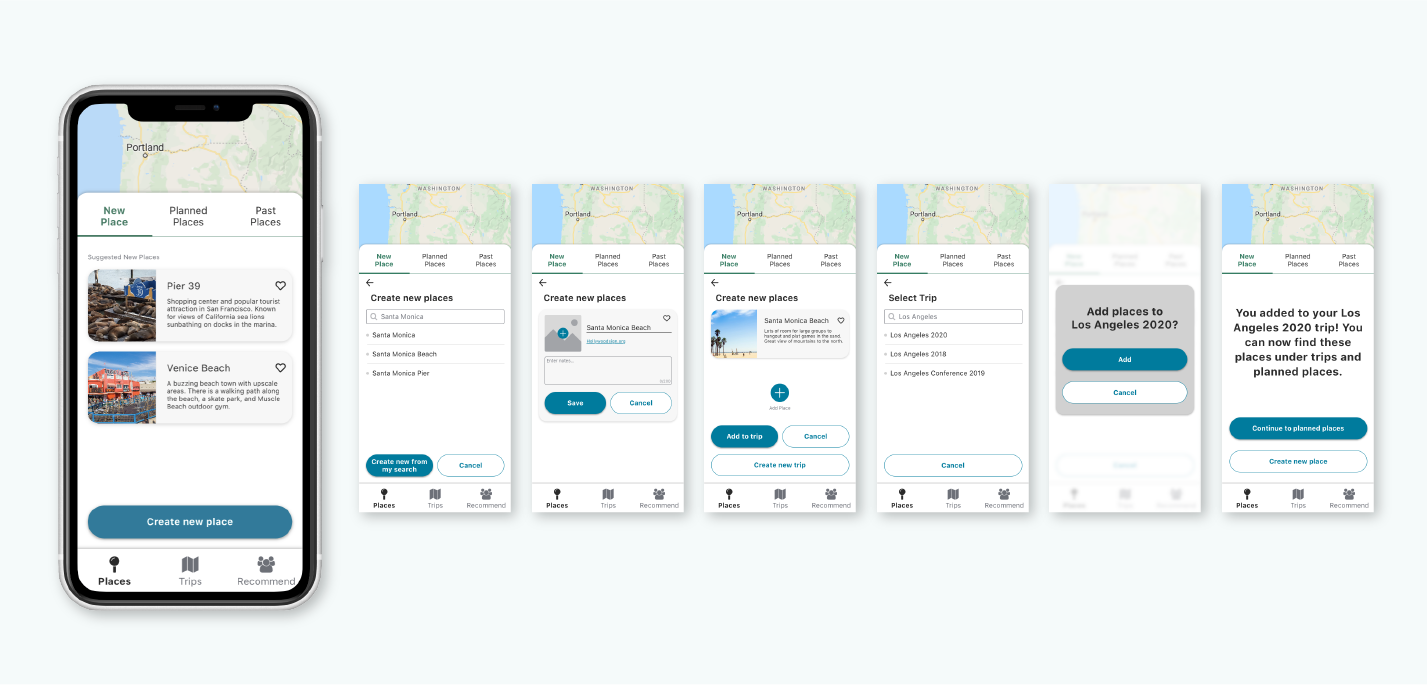
create place
Usability Testing
Usability Test #1
5 participants took part in remote testing using Zoom or Google Hangouts. Participants ranged from 26-35 years old, all of which are frequent mobile app users and enjoy traveling. Each participant is given the same tasks to perform and then asked several follow-up questions after all tasks were completed. Each session lasted about 20 minutes.

Top issues include ”Recommend” word used in the tab bar was found as confusing, favorited experiences difficult to find, and personal information required at registration.

revised menu bar, tab bar naming, and registration with privacy information
Usability Test #2
After critical and major priority findings from the first usability test are revised, a second round of usability testing is conducted with 5 new participants using the same criteria. Each participant is given the same three tasks to perform and then asked several follow-up questions after all tasks were completed. Each session lasted about 20 minutes.

A list of further usability issues are discovered with the most important issue being the length of user contact list.
Reflection
Moving from Prototyping into usability testing, I thought I had a rock solid application. I learned the value that new eyes can bring to the table when I uncovered several findings in both rounds of user testing. With each round of testing the product was able to grow more robust.
Next Steps
If this project were to continue, I would refine the prototype even further based on the rest of the findings in the usability test report, and build out the remaining screens for “Places”, “Trips”, and “Share” including any empty states. If this was a live product, I would have been in contact with the development team throughout the process to make sure the handoff at this point would go smoothly. Once the product would launch things turn to maintenance mode, making small adjustments as users reveal new issues or ways to use.