

Project Snapshot
The Problem
Homeowners require a simple and efficient way to view their home loan details and take necessary actions related to their mortgage. However, the existing application is basic and lacks necessary loan details, resulting in low engagement and adoption rates. In addition, new regulations from the government require real-time updates to the application, further complicating the user experience. Therefore, our objective was to redesign the application, incorporating new features and branding to improve usability and increase user engagement while staying compliant with the latest regulations.
The Solution
Through a user-centered design approach, we were able to create an intuitive and easy-to-use platform that empowers homeowners to take control of their home loans. Our goal was to design and implement a comprehensive user experience strategy that involves updating the app's branding, building out new features, researching and designing real-time needs to comply with the new government regulations, and laying the groundwork for future capabilities.
My Role
As part of a three-person UX design team, I contributed to the research and redesign of a B2C application. Our approach combined new branding efforts from the marketing team with data-driven design to refresh the user experience.
Users & Audience
Homeowners in the United States who have taken out a home loan and want to view their mortgage details and take actions related to their loan.
Research
Site Map
Creating a sitemap was an important part of our research process for this project. Our team recognized that having a clear understanding of the app's layout and hierarchy of screens was crucial to ensuring a smooth user experience. By mapping out the layout of all screens in the application, we were able to gain a clear understanding of how users navigate through the app and identify any potential accessibility issues, prevent dead-ends, and find any gaps in the user flow.
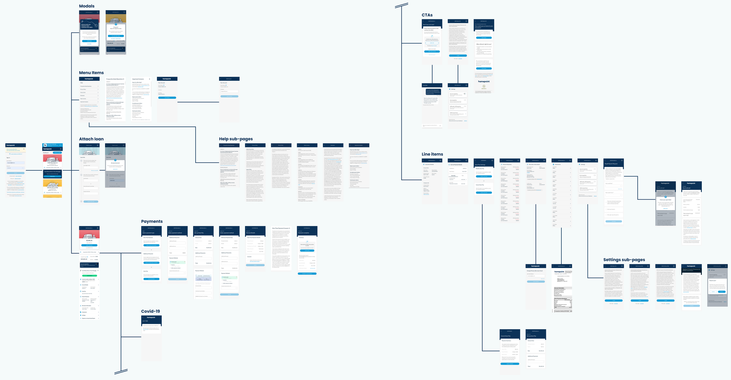
This helped us to identify areas where we could improve the user experience and make the app more intuitive and easy to use. Additionally, the sitemap helped us to identify any areas where content or functionality was duplicated, or where important information was buried too deep in the app. This exercise allowed us to make informed design decisions and improve the overall user-friendliness of the app for our intended audience.
Analytics
Analytics provided an understanding of how users interacted with our application. We were able to identify patterns and trends in user engagement, such as which screens were most frequently visited, which features were most used, and where users were dropping off. We also gathered valuable data on user demographics, which helped us better understand our target audience and their needs. This information allowed us to make data-driven design decisions, such as optimizing the layout and content of certain screens, adding new features to address user pain points, and streamlining the user flow to reduce friction and increase engagement.

User Feedback
User feedback is critical to understanding the needs of our users, and we made sure to incorporate it throughout the design process. We included quick surveys in the existing red routes to get immediate user feedback, as well as establish a survey pattern for new features to get continuous feedback from our users. This approach ensured that we were able to make necessary adjustments to enhance the overall user experience. Going forward, this ongoing feedback resource will be a great tool for future iterations and updates of the application.

Proto-Persona
Proto-Personas were formed from brainstorming sessions with stakeholders and backed by data collected from research. They help provide valuable insights into the user's motivations, goals, and pain points which gives us a starting point to create solutions that meet the needs of the user. Surveys were send out to stakeholders, SMEs, and other internal team members to gathering qualitative information regarding user’s needs, goals, and pain points.

The data from these surveys were used for affinity mapping to distill insights into our target users. Two personas were crated to represent our user types based on the highest occurring themes.

Design Process
Feature Backlog
Through a combination of insights gathered from the site map, analytics findings, survey responses, and business needs, we were able to create a backlog of new features that were strategically designed to address the needs and pain points of our target audience. This process allowed us to prioritize and plan the addition of these features in a comprehensive and efficient manner. Additionally, as the federal government passed new regulations during the project, we had to quickly research and design features to comply with these changes. This added an extra layer of complexity and required me to be agile in adjusting priorities to ensure the app remained compliant and user-friendly.
Live Chat
Live chat was added to the application as a tool to increase the number home loan refinances. The purpose of the live chat function is to provide users with quick and personalized support throughout the refinancing process. By offering a direct line of communication with agents, users can get answers to any questions or concerns they may have, ultimately increasing their likelihood of completing the refinancing application. This feature was specifically implemented as a business need to increase conversions and provide a better user experience.

Flex Pay
Making payments is the number one flow used on this application, Flex Pay was developed to make setting up payments more flexible and easier for the user. By introducing a few different payment options, users can now better manage their finances and budget accordingly. This feature also outlines the financial benefits of choosing to make payments more frequently, helping users to save money on interest and pay off their mortgages faster.


TCPA
The TCPA (Telephone Consumer Protection Act) feature was implemented to ensure compliance with federal regulations. This feature allows the user to provide consent for Homepoint to contact them via call or text for marketing purposes, as required by the law. With this feature, the user can now easily opt-in or opt-out of receiving marketing messages from the company, making it a valuable addition to the app.

FAQs
The FAQ section is a fundamental part of any user experience, serving as a go to resource for answering the most common questions that users may have. In the previous design, the FAQ section was presented as a PDF that users had to manually access. Since the FAQs are related to the whole company, not all of them made sense to be on the mobile app. Dot voting was used to determine what FAQs should be included on mobile.

The redesign aimed to create a more streamlined and user-friendly experience by integrating the FAQs into the product itself, making them easily accessible. By providing this convenient and efficient resource, we aim to improve user satisfaction and reduce the need for users to reach out to our support team for assistance.

The Future of Homepoint
Design Sessions
During the redesign of this homeowner app, our team was tasked with creating a “next gen” version. We focused on optimizing the user experience of key features, such as refinancing loans, loan timelines, and viewing loan details. Given the unprecedented low interest rates driven by Covid-19 measures, refinancing was a top priority for users. We aimed to make the refinancing process seamless and informative to capture the most business as possible.
Loan timelines were also a big area of focus since they allowed us to deliver time-sensitive information to users in an efficient and effective manner. By displaying the right information at the right time, we aimed to increase user engagement and conversion rates.
Through user research, it was discovered that the majority of users only had one loan, making the initial dashboard screen with multiple loan options irrelevant. The decision was made to have users land directly in their loan details after login, with the ability to change properties within the same view for those few users that had multiple loans. This change helped simplify the user experience and improved usability for the majority of users.
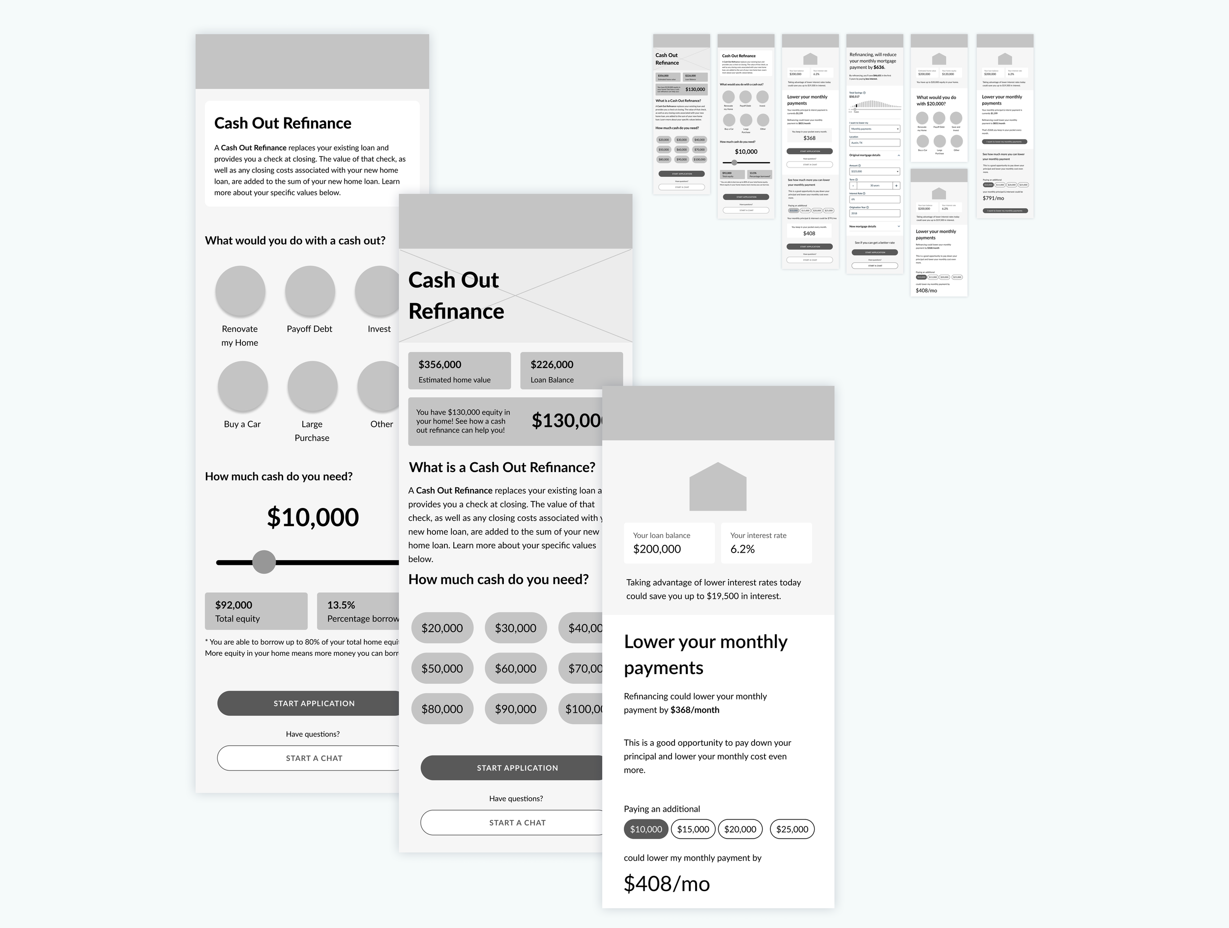
Refinance wireframes

Loan timelines
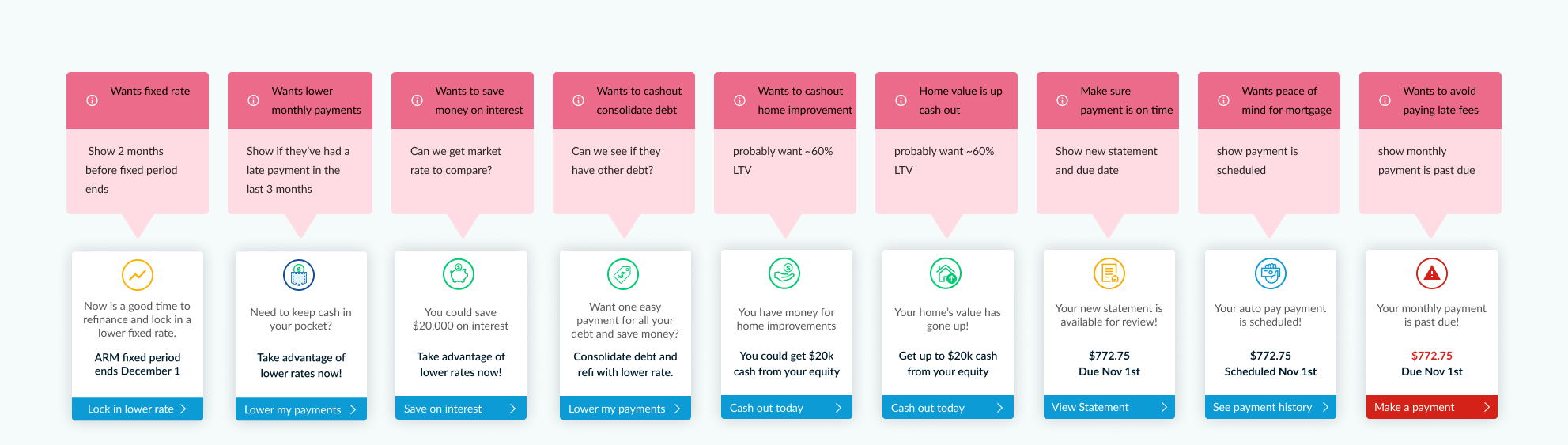
Strategic timeline cards

Loan details exploration

Payment details
Reflection
Throughout this project, I faced various challenges such as adapting to Covid-19 regulations and complying with government regulations that required collaboration with legal and compliance teams to ensure designs were approved. These challenges provided me with valuable experiences in communication and collaboration, as well as the opportunity to develop my wireflow and project management skills. I also had the chance to redesign various sections of the application from the ground up, allowing me to further develop my design thinking skills and gain insights into user research. Furthermore, the experience of selling the application as part of a broader deal taught me valuable lessons about the business world. Overall, this project provided me with the opportunity to learn and grow as a designer, and I am excited to apply these skills to future projects.